Mockingbird, Cappuccino, and what really matters.
I found an interesting critique via daring fireball regarding the latest Cappuccino application, Mockingbird. I’m really glad this has come up because I think the concerns are valid and I’m excited that we can start having a conversation about this. One comment in particular really stuck out for me:
If you load the app, you can see custom scrollbars and navigation, a complete lack of accessibility, non-native controls, and all those other things that cause geeks to hate Flash.
This is a classic programmer’s misunderstanding of a design problem. Listen carefully guys: pure native controls aren’t what matters. What users actually care about is broken and ugly controls. This should be incredibly obvious from the fact that many of the most popular applications on the Mac use custom “non native” controls, such as Tweetie, iTunes, Quicktime, every single Apple Pro App, and Acorn just to name a few. In fact, its almost par for the course now adays.
Now, I haven’t heard a single complaint that Tweetie for the Mac doesn’t have blue aqua scrollbars. Why? Because the Tweetie scrollbars work well in this setting and look good. The reason people hated Java’s UI’s wasn’t because they were “non native”, its because they were ridiculously horrendous and behaved poorly to boot. Instead of admitting that what was needed was good designers, programmers simply drew the lazy conclusion that every control had to be drawn by the system to give it some sort of magical properties. This is exactly the problem with Flash. What frustrates me about the scrollers in Balsamiq isn’t simply that they’re different, its that they don’t work with my scrollwheel mouse and look incredibly out of place.
In Cappuccino we’ve taken two important steps: First, we’ve relentlessly implemented all the “native” features of scrollers (and other controls of course) people have come to expect: from command+clicking in the track to respecting horizontal scroll to listening to arrow keys. Have we missed one? Perhaps, in which case you should file a bug. Or better yet, fork the project and ship your fix immediately to your users, something you can’t do with Flash or the built in controls in HTML. Secondly, we’ve hired a real design firm, Sofa, to make a UI that truly looks awesome on the web: Aristo. You should take a look at their Cappuccino application EnStore and try to argue that this thing doesn’t feel great:
The second assertion was the following:
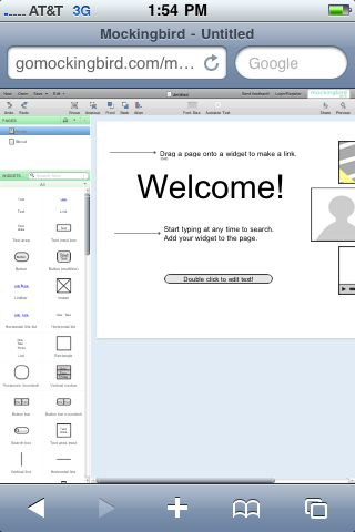
Gruber’s definition of “true web app” and mine greatly differ. Clue: If it’s completely unusable on the iPhone Safari browser, it doesn’t matter if it’s built in JavaScript, Flash or Microsoft Visual Fortran 2012. It’s not a “true web app”
Well, for starters:

Mockingbird on the iPhone
But let’s get to the real issue here, because this is once again a misunderstanding of design vs. programming. HTML, JS, and CSS do not magically create wonderful experiences on every platform they are run. As you can see from the above screenshot, they certainly have the nice side effect of working on said platforms, but if you’re expecting HTML to somehow handle the subtle and explicit differences between a handheld multitouch peripheral and a desktop application, well then you’re doing it wrong. These are completely different environments and they require completely different designs and often implementations. The reason mockingbird is “completely unusable” on the iPhone despite loading up fine is because it was designed for a large screen. Photoshop written with perfect semantic markup or however you want to define a “true web app” won’t work on a small screen either. Clearly though, the nice side effect of using Cappuccino is that you’ll at least be able to share common source code between both versions of these apps.
I think the fundamental conclusion here is that people get really hung up on the “web” part of web apps, when they should be focusing on the “app” part. At the end of the day, you are delivering your customer an experience. I believe that someday all apps will be web apps, and then this will become much clearer. At that point, what will matter in a mobile web app is the mobile part, and what will matter in the desktop web app is the desktop part.